

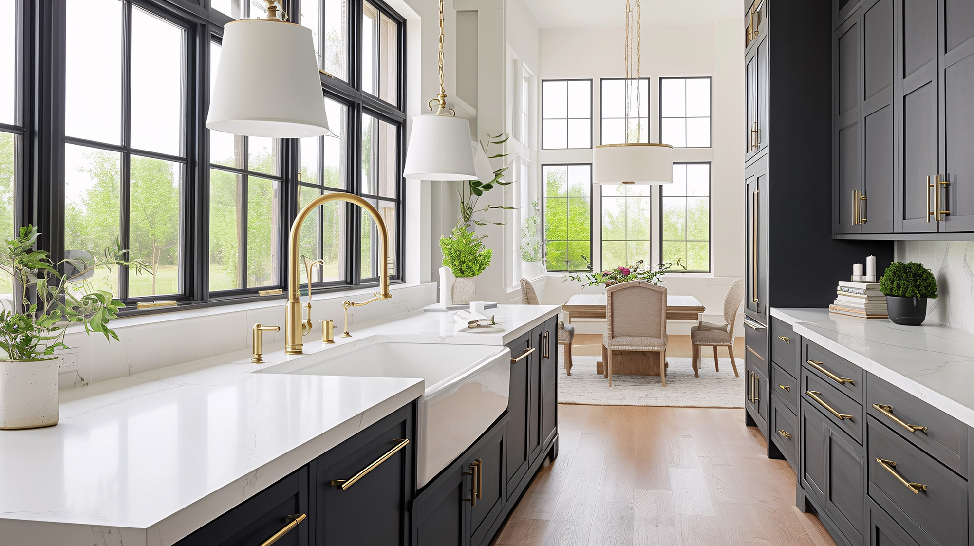
Choosing a countertop color is about more than following a passing trend. For homeowners in Daphne, Alabama, the right surface should feel inviting, complement the home’s architecture, and remain practical for everyday Gulf Coast living. We are seeing more homeowners move away from stark whites and cool grays in favor of warm neutrals that create a softer, more comfortable atmosphere.
At Hard Rock Stone Tile & Flooring, we help homeowners explore custom stone and quartz countertops alongside coordinating tile, natural stone, glass tile, flooring, and kitchen-remodeling options. This makes it easier to view the countertop as part of the complete room rather than as an isolated purchase.
Why Warm Neutral Countertops Work in Daphne Homes
Daphne homes often feature abundant natural light, open living spaces, and interiors influenced by the relaxed character of coastal Alabama. Warm neutral countertops support that style without making the kitchen feel overly themed.
Cream, sand, beige, taupe, mushroom, and warm white can make the room feel bright while remaining more forgiving than pure white. These shades also work with a broad range of cabinet finishes, backsplashes, flooring materials, and decorative hardware.
We often recommend warm neutrals because they provide flexibility. A homeowner can update cabinet pulls, lighting, paint colors, or furniture later without needing to replace the countertops. This adaptability is especially helpful when the kitchen connects directly to the dining or living area.
Cream and Warm White Countertops
Warm white remains one of the most versatile countertop color families. Unlike a crisp, blue-toned white, a creamy surface introduces subtle warmth and can prevent the kitchen from feeling cold or clinical.
A warm white countertop may include:
Soft beige veining
Subtle gold movement
Light taupe markings
Delicate gray-brown details
A lightly textured or clouded background
These features add visual character without overwhelming the room. Warm white quartz can provide a clean and controlled appearance, while natural stone may offer more variation from one section to another.
We suggest pairing warm white countertops with natural wood cabinets, soft greige cabinetry, muted green paint, or classic white cabinets with warm undertones. A backsplash in handmade-look ceramic tile or lightly varied natural stone can complete the design.
Sand, Beige, and Coastal Taupe
Sand and beige countertops are returning in a more refined way. Today’s beige-inspired surfaces often include layered tones, fine veining, or gentle movement that gives them a current appearance.
In a Daphne kitchen, sandy colors can connect the interior to the surrounding coastal landscape without relying on obvious beach motifs. They work beautifully with oak, walnut, painted cabinetry, and warm luxury vinyl flooring.
Taupe is another useful choice because it sits between gray and brown. It offers the familiarity of gray but feels warmer and more welcoming. A pale taupe countertop can balance cool stainless-steel appliances while still coordinating with bronze, brass, black, or nickel fixtures.
Soft Greige for a Balanced Look
Greige continues to be popular because it blends the versatility of gray with the warmth of beige. However, we recommend paying close attention to the undertone. Some greige surfaces lean noticeably cool, while others include brown, cream, or subtle golden notes.
Before making a final decision, we encourage homeowners to compare samples in the kitchen during different times of day. Natural morning light, afternoon sun, and evening lighting can change how a countertop color appears.
It is also important to place the sample near the actual cabinets, flooring, backsplash, and wall color. A countertop that looks perfect by itself may behave differently once it is surrounded by other finishes.
Earth-Inspired Countertop Colors
Homeowners who want more depth can consider clay, putty, mushroom, or light cocoa tones. These colors can create a grounded, high-end appearance while remaining neutral enough for long-term use.
Earth-inspired countertops look especially attractive with:
Natural or stained wood cabinets
Cream or ivory walls
Textured tile backsplashes
Matte black or aged-brass hardware
Warm wood-look flooring
Woven or natural-fiber accents
Rather than making every finish match exactly, we like to build a layered palette. The countertop might introduce the primary neutral, the backsplash can add texture, and the flooring can bring in a slightly darker tone for contrast.
Choosing Between Subtle and Dramatic Veining
Color is only one part of the countertop decision. The amount and scale of veining can significantly affect the kitchen’s overall character.
Fine, delicate veining creates an understated look that works well in smaller kitchens or rooms with detailed cabinetry. Larger, more expressive veining can turn the island or countertop into a focal point. If the surface has dramatic movement, we usually suggest keeping the backsplash or surrounding finishes quieter.
For an island, waterfall edge, or large uninterrupted countertop, bolder movement may have room to shine. In a kitchen with many seams, corners, or small countertop sections, a more consistent pattern can be easier to coordinate.
Creating a Complete Kitchen Palette
A successful countertop selection should connect naturally with the rest of the space. We recommend beginning with the finishes that are least likely to change, including the cabinets, countertops, and flooring. From there, backsplash tile, paint, lighting, hardware, and accessories can support the overall palette.
Hard Rock Stone Tile & Flooring offers countertop services as well as tile, natural stone, glass tile, luxury vinyl, hardwood, waterproof flooring, and kitchen-and-bath solutions. Our design and material-selection support can help homeowners coordinate these elements with greater confidence.
Warm neutrals offer Daphne homeowners a practical way to create a bright, comfortable kitchen that feels current without becoming dated too quickly. Whether you prefer creamy quartz, softly patterned stone, sandy beige, or balanced greige, we can help you compare the colors, movement, and coordinating materials that make the entire room feel complete.


